Chapter 14: "Channel Your Panels"
Some details, ideas, and musings I've had experiencing effective RPGs and RPG Makers
© May 2019 Written by David Wicker
Please do not reprint without permission
Last week we went over the SPRITE and its use in RPGs.
Today we are going to go over panels and see the difference and possible advantage they have over tile and sprite based RPGs and adventure games.
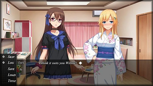
Panels means that you are building your RPG or RPG Maker with, well, let's call it that, panels in mind. That is, you choose a single image background that usually fills the screen and insert sliding sprites from left to right or vice-versa, and usually they are huge, about half the size of the full screen or even bigger.
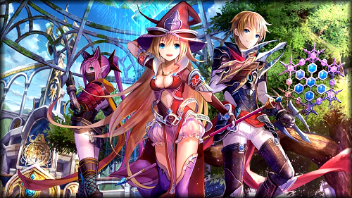
As you can see a 3-dimensional picture is set in the background and a large sprite (usually only the face and torso are seen) can either fade-in or slide-in from left to right or vice-versa.
This method does have some distinct advantages over tiles. Let's go over them:
[1] No need to connect a bunch of tiles together to make a room.
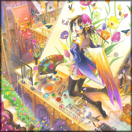
[2] Sprites are not small (32x32) but huge and great detail can be made with them.
[3] Monsters can be huge too with tremendous depth and ability of the artist.
[4] Have 2-people talk by having them appear and face each other.
[5] Ability to choose arbitrary directions with menus instead of limited to up, down, left, or right.
Now let's look at the disadvantages.
[1] Requires a professional artist to render any and all of these large graphic elements.
[2] No "mazes" or "dungeons" where the player wanders around and can get easily lost.
[3] No ability to see "behind" you. In tile-based you can see all around you.
[4] No NPCs wandering randomly on a map. They instead must appear as a portrait like above.
[5] No "dodging" monsters through clever running around them on a tiled map.
Alright, that's a good start. Because of these differences it is rare to find RPGs or adventure games that meet the criteria of true panel games. The exception is with dating games which seem to always use this method for some reason.
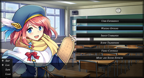
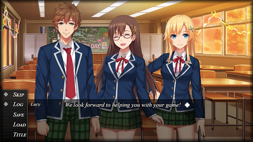
Communication with others, either your own party members or NPCs is accomplished by having two or more full-size portraits of their image on the screen. Added effects might include mouths moving or showing classic signs of happiness, anger, or stress through facial expression, eye mood, and hand positions.
So it's pretty easy to see how to make a conversation for your game, but what about combat ? How is that handled ?
There are several ways
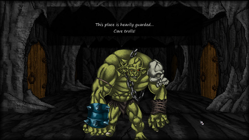
you could do it. One method could be a 1st-person view, where the
monster appears directly in front of you and there is a spooky
background, like a dungeon in the distance.
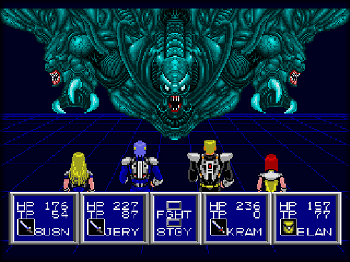
The 2nd type is to have a 1st person view like above but to show the faces and status of all players - from the back.
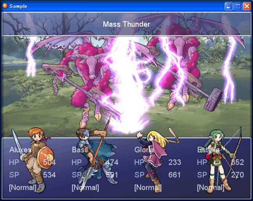
A 3rd non-conventional method could be to have it just like above but instead of showing the backs of the players, have their front and full body appear, from head to foot, and directly included in a separate information panel.
A popular one is to keep
the 1st-person perspective for the background like the above and for the attackers but instead
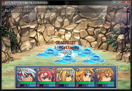
of showing the backs or fronts of the players, this time show just their faces or portraits in individual panels - just for each of them.
But maybe have it so the stats don't actually overwrite the images of the players as seen here.
Another one I've seen only a
few times is where the monster comes charging from one side and the player running from the
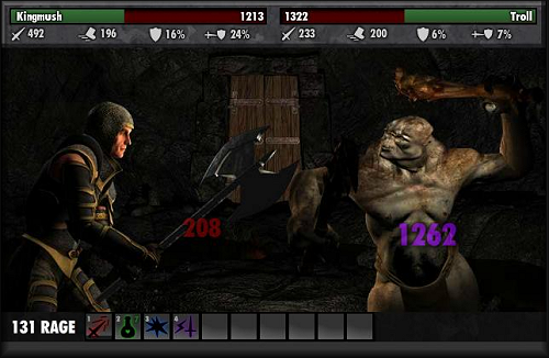
other. Useful for direct one-on-one combat where the player will never have companions to assist.
Yet this is still and clearly a panel combat. You have your 3D looking background and two sprites facing each other, in this case actually bigger than half the screen. You are only limited by your imagination and art ability.
. . .
And that's about it ! So now you can see the difference between the two.
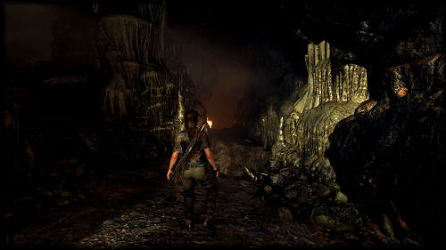
Backgrounds of panel RPGs may appear to be just like your standard 3D 3rd-person games, but they are not. You cannot travel through them. And instead of showing the back of the player at all times on the screen, instead he/she and more may appear directly on top, their legs out of sight and facing the gamer to show detail in their clothing and accruments.
. . .
If you're an artist busting with incredible ability, you should definitely look into writing panel RPGs and adventure games instead of simpler tile-based and small sprite-based RPGs.
Next week we'll cover some of the more interesting and complex layouts in Boss combats and why some of them are so difficult for a player to beat. It's not just high hit points but other interesting factors come into play.
Until then, bye for now ...



 Flag Writing