Chapter 12: "A Viewtiful Mind"
Some details, ideas, and musings I've had experiencing effective RPGs and RPG Makers
© May 2019 Written by David Wicker
Please do not reprint without permission
Okay, I know I mentioned that this week we would be going over Sprites, non-player-characters, and the scripts that run them, but I'd rather go over viewpoints at this time. No, not political or plot but actual viewpoints, that is, what you see with your eyes when you are playing an adventure game.
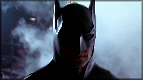
As Batman once said, "Things change ..."
So with that, let's go over the types of views that there are, not just in RPGs, but really any game you play on a console, handheld, tablet, or PC.
Viewpoints. There are several. To list we have, topview (3 of 'em), sideview, first person, second person (yep, it really exists), third person, isometric, and "Crappy Ultima."
Yep, Ultima gets its own category as they made a really WEIRD way of projecting graphics for several of their games. This does not mean that Ultima itself is a bad game - just - they really went off on a tangent with a unique graphic presentation method that looks IMHO perfectly horrid.
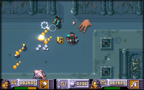
The first is foremost, topview. Topview in games of course is where you see everything from above. There are three types of topview. Topview where you can only see the tops of people's heads and their arms and legs pump out from time to time - not a very good look.
Or you can cheat a little bit and give them a slight effect of showing the full sprite with the head being big, the chest smaller, and the legs just about out of sight. The most popular view in RPGs in the third one for topview, where you can see the sprite entirely, no distortion to head, arms, legs, or chest, even though their movements cover what you would see from topview.
That is, moving up, down, left, and right, you would see the player facing back, forward, and left, and right. For now, let's look at the first.
Here is an example of the first topview. As you can see the player can be seen just as if there was a camera above him. It also looks authentic and real. You would ACTUALLY see this in real life if you were up on the ceiling. This is all good and well but you can't really make out facial features and details of what they are wearing. Everything is all "arms" too. That's the only feature you can clearly make out clearly.
Here is the 2nd topview. A rare one to be sure. This is a little better, but you still have "body parts" overlapping one another when you turn and rotate. It's kind of like the video-camera is at the top but from a lower angle, looking not directly above but from a 50% elevation from the ceiling. It's better, but still looks a little strange and might make it tricky for you to draw images at this rarely used angle.
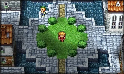
Here is the one we are most familiar with. The third topview.
While on a reality level this is actually impossible unless all the players are crazily laying on their backs, it is the one that is most used and the one that most players are familiar with in RPGs and turn-based adventure games.
The advantages of this viewpoint are clear. You can easily see all the details of the face and what the sprite is wearing. Also you can add a bit of 3-dimensional depth by adding shading and having some sprites larger than the player so when they pass behind it, only part of the sprite is seen.
Okay !
Now before you tell yourself you're just going to use that 3rd view, which incidentally is my favorite, there are still others to consider.
Let's look at sideview, it's advantages and disadvantages.
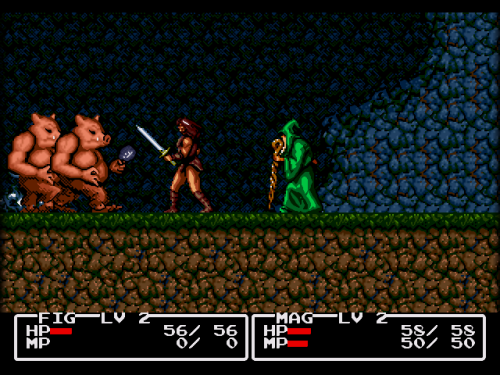
The quality and angle of the sprites look very much like the third topview.
But there are some subtle differences in sideview. You should note that the camera is directly on the ground, level with the player. You can also only move left or right and because of this, usually the sprites for the player and those they converse with are quite large, a 3rd the vertical size of the screen or even larger.
The advantages of this viewpoint are larger sprites and more detail to the graphics. The disadvantages are the only way the player can move UP essentially is with a ladder or they go down by falling into a pit or climbing down stairs or something.
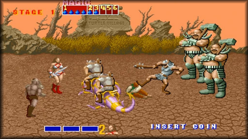
For the most part the entire WORLD is just one long horizontal strip. You can't have anything recede in the distance that the player can reach, unless it's something sort of like Golden Axe.
Where you can move back a little by moving the sprite up slightly, and "nearer" by moving it down slightly. While this is fine for most action games, especially shooters, it may pale if you try to make a turn-based adventure game out of it as it really is designed for great sprite animation and multi-frame action combat and sprite images.
. . .
The other three viewpoints to cover are 1st person, 2nd person, and 3rd person. Yes, there really is a 2nd person viewpoint if you didn't know.
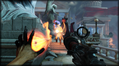
First person viewpoint is popular when you want the player to feel like they ARE in the game, really. A good example of this is BIOSHOCK (seen above). All you see are your arms and what's carrying them if even that. You must rotate the entire world to look behind you and absolutely everything is true 3-dimensional - like you're really there and seeing it with your own eyes.
While the advantage of this is it is quite immersive as you see essentially what your own 2-eyes see around you in the real world, the disadvantage (at least for me) is for the most part you do not have a rear-view mirror and enemies can sneak up on you from behind or even the sides and do great damage.
It is also remarkably easy to get lost. Imagine yourself placed in a real maze and can only see the walls in front of you and not behind you. Unless you have a great sense of direction - you won't even make it out of the first room.
This is a good viewpoint for, once again, action games, and probably will not fare too well for turn-based RPGs unless they are Dungeon Crawlers.
2nd person viewpoint is rare to find these days.
Let me see if I can describe 2nd person viewpoint correctly. It is not 3rd person which we'll cover shortly.
Lakitu is watching Mario through his camera. So we are seeing what he is seeing. He films Mario as he runs around in his adventure. But we always only see Mario through Lakitu's (2nd person) camera. It is a 3-dimensional view but it need not always be.
2nd-person is just that. Someone ELSE is watching the main player, and it is not you but an independently operating element. You have no control over it though the "camera" favors to see the player at all times.
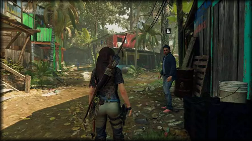
The well-known 3rd-person view is about the most popular view for action adventure games today. In it, the player is always seen just ahead of the camera. The player can turn to face the camera, but if they approach too close, the world rotates to show their back again.
This can be a useful viewpoint as it allows the player to see attackers sneaking up from the sides and some even from behind (if they are close enough). It gives the player an excellent view of their main character (especially their butt) and can take as much as half to more vertical space on the screen.
The disadvantage is much like 1st-person perspective, you must rotate your world in order to see behind you. It might also be difficult for you to draw or render sprites or 3-dimensional graphic elements at this high a caliber. Something to consider. It also does not encourage turn-based RPGs as the player will be more interested in the animation and what their character can do in real-time adventures and situations.
. . .
Okay, now we're getting into muddy water. There are two remaining viewpoints neither of which I like very much. One is the isometric, and the other, the very nasty NASTY and rather unique "Ultima" viewpoint.
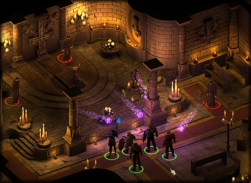
This viewpoint, "isometric," is very popular with turn-based, tactical, and strategical games. I'm not really sure why. I guess because you can't really hide anyone by placing them behind something. Not easily. And because of this viewpoint you can easily make true 3-dimensional objects that have correct depth and shadowing.
The problem comes with player movement. Early isometric games would only allow you to move UP and LEFT, UP and RIGHT, DOWN and LEFT, and DOWN and RIGHT by pressing on UP, DOWN, LEFT, and RIGHT arrow keystrokes. It was impossible to actually move in a visual straight-line !
Modern isometric games today let you move normally UP, DOWN, LEFT, and RIGHT, but in the game itself you are actually still moving diagonally each time you do this when you take into account the skewed camera angle and viewpoint.
Tricky stuff ! And it might even be trickier for you to draw not just the tiles to match this viewpoint but sprites as well.
Saving the worst for last, let's take a look at what horrible thing Ultima did.
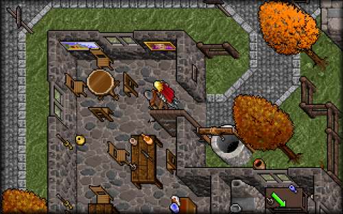
Oh my God, what a nightmare ! What the heck were they smoking when they came up with this ? Alright, yes, I know, this is a very BIASED opinion of mine on negativity but just - look at it ! Man ! What went wrong !?
Strangely there are some players today that rather favor this viewpoint and missed it when it was removed.
Quite simply I'm lost with it; not even really sure which direction is up or down in this. I guess you kind of glide along at an angle and heaven help your animation if you try to climb a ladder or stairs or something.
But ... I did want to show you, there are indeed mixed views (and mixed feelings) about what viewpoints in games and adventure games there were then and are now.
. . .
*
That should do it ! What do you see ? What do you want to see ? It's only up to you and your imagination whatever viewpoint you'd like to have in your RPG and adventure game and what you'd like your players to see. The classic and tried topview #3 or - something entirely different ... !
. . .
Next week we'll cover (I promise) the topic of SCRIPTING. That is, what happens when you touch a tile, object, or NPC on a map ? How do they respond ? How do they remember things the player has done since the last time they talked to them ? And how can they instrumentally help the player in their adventure and quest ?
These questions will be answered. Until then, bye for now ...






 Flag Writing